Cancel Flows
CSS Classes Available
## General Components
.ck-style ## applies to everything
.ck-modal ## the embed pop-up
.ck-background-overlay ## the partially transparent overlay
.ck-step ## a wrapper around all content

## specific steps in flow
.ck-pause-step
.ck-discount-step
.ck-contact-step
.ck-redirect-step
.ck-survey-step
.ck-freeform-step
.ck-confirm-step

## while a customer subscription is being modified
.ck-progress-step

## once flow is complete - after discount, pause, cancel
.ck-complete-step

## if error is shown at any point (hopefully customers will never see this)
.ck-error-step

## Step components
.ck-step-header
.ck-step-header-text
.ck-brand-image
.ck-brand-image-header
.ck-step-description-text
.ck-step-body
.ck-step-footer

## Button variations
.ck-button
.ck-text-button ## custom color
.ck-black-text-button
.ck-primary-button ## custom color
.ck-black-primary-button
.ck-gray-primary-button
Example CSS Override
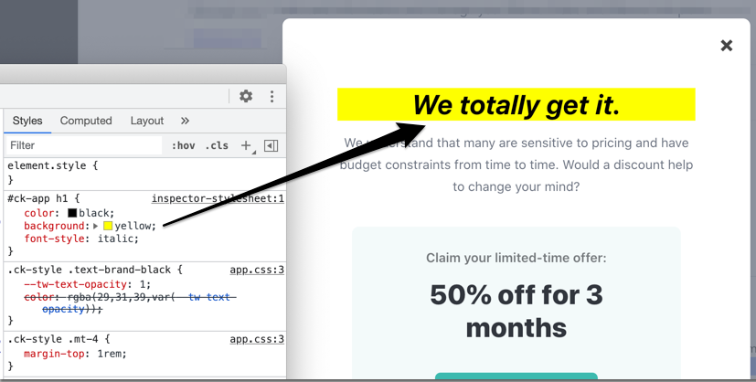
For simplicity, assume you want to modify the header text's appearance. The following CSS rule uses the top-level embed id and targets the specific element that needs styling.
#ck-app h1 {
  color: black;
  background: yellow;
  font-style: italic;
}
Here's how that looks in Chrome dev tools.