Cancellation Trends
The Cancellation Trends dashboard provides comprehensive insights into why customers cancel their subscriptions, helping you analyze selection rates for each cancellation reason, compare segments, and monitor changes over time.
Why It Matters
Cancellation data reveals critical insights into customer motivations and pain points, enabling strategic business decisions that directly impact retention and growth.
For instance, if the cancellation reason "Budget" consistently accounts for a significant portion of cancellations, it likely indicates customers are struggling to see sufficient value relative to your pricing. This presents an opportunity to clearly communicate and reinforce your product's value by highlighting key features, benefits, and successes in your marketing and onboarding materials.
Alternatively, if cancellations due to "Missing Features" are prominent, this indicates a gap between customer needs and your current offerings. Leveraging this insight, you can prioritize product enhancements and development efforts around the features most requested by your customers. Acting on this feedback directly addresses customer concerns, reduces churn, and ensures your product evolves in alignment with customer expectations.
How It Works
For each cancellation reason displayed in the Cancellation Survey (e.g., "Too expensive", "Missing features"), Churnkey tracks how frequently customers select each option relative to how often it was presented.
Unlike traditional distributions where all options share the same denominator, each cancellation reason's selection rate is calculated exclusively from sessions where that specific reason was displayed.
Important: The number of times a reason is displayed can vary significantly, especially when you make changes to your cancel flow. Common scenarios include:
- Adding or removing cancellation options from your survey
- A/B testing different reason sets for different customer segments
Each percentage therefore represents the selection rate within that reason's unique set of presentations - not a universal comparison across all reasons.
Calculation
- Displayed: The number of times a reason was presented to customers in the cancellation flow.
- Selected: The number of times customers actually chose that reason.
- Overall: The percentage of times the reason was selected out of the times it appeared.
Example Calculation
Let's walk through a real scenario:
First Version of the Flow
100 sessions collected, with two options:
| Reason | Times Displayed | Times Selected | Overall (%) |
|---|---|---|---|
| Budget | 100 | 70 | 70% |
| Missing Features | 100 | 30 | 30% |
Second Version of the Flow
Another 100 sessions, with a new option:
| Reason | Times Displayed | Times Selected | Overall (%) |
|---|---|---|---|
| Budget | 100 | 50 | 50% |
| Other | 100 | 50 | 50% |
Combined Results (as shown in the dashboard)
| Reason | Total Times Displayed | Total Times Selected | Overall (%) |
|---|---|---|---|
| Budget | 200 | 120 | 60% |
| Missing Features | 100 | 30 | 30% |
| Other | 100 | 50 | 50% |
Using the Cancellation Trends Dashboard
Select Segment
You can filter the data by customer segment using the Select Segment dropdown. This allows you to analyze cancellation reasons based on each cancel flow. Selecting a segment updates all displayed metrics and trends to reflect only that group.
Compare Segments
You can hover over any cancellation reason on the right to see how it compares across different segments.
- When the Primary Flow is selected: Hovering will show a tooltip that compares how often that reason was selected in the Primary Flow versus all other segments combined. This helps you understand if certain reasons are more common in your main cancellation path.
- When another segment is selected: The tooltip will compare that segment’s results to the Primary Flow, highlighting differences in cancellation behavior between customer groups. This makes it easier to spot trends and tailor your cancellation experience based on what each segment is telling you.
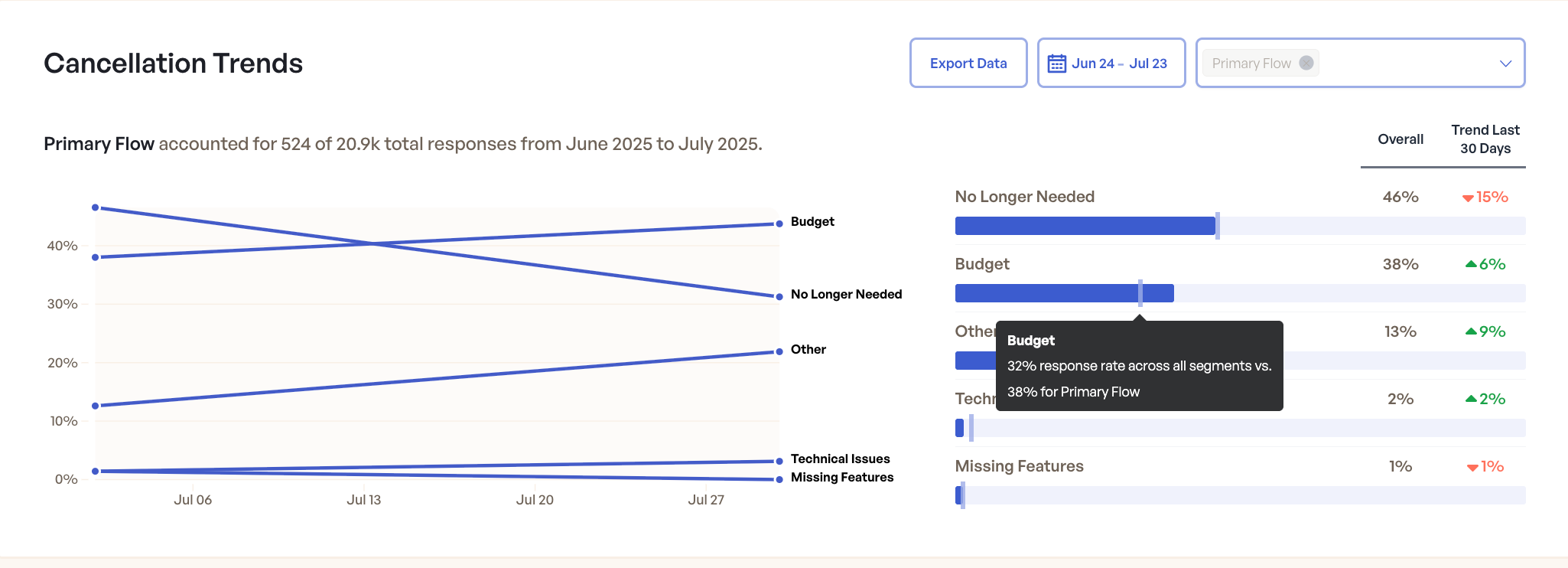
Example: The dashboard shows how cancellation reasons and their trends compare across segments. Hovering over a reason displays a tooltip with detailed comparison.
Trend Last 30 Days
For each reason, the interface displays the trend (increase or decrease) in selection rate over the last 30 days compared to the previous period. This helps you quickly identify which reasons are becoming more or less common.