Appearance
Overview
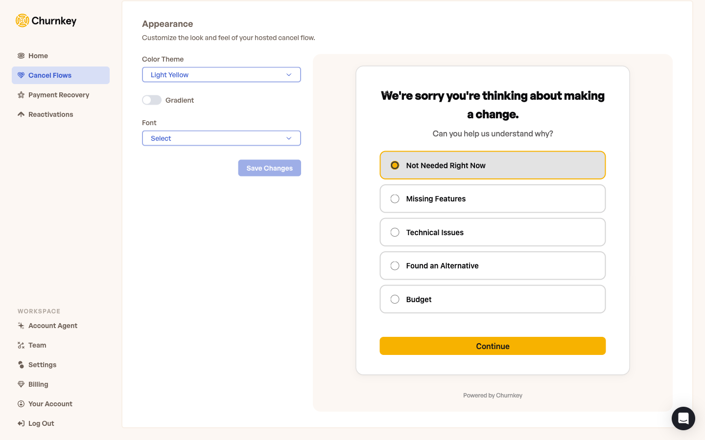
Appearance settings live under Cancel Flow → Hosted → Appearance in the Churnkey dashboard. The panel is designed to be fast to use: pick a theme, decide on a gradient, choose a font, and watch the hosted page update in real time in the live preview next to the controls.
All three domain options — the fallback URL, your Churnkey subdomain, and your custom domain — share the same appearance settings. There is no separate styling to maintain per domain.
Color Theme
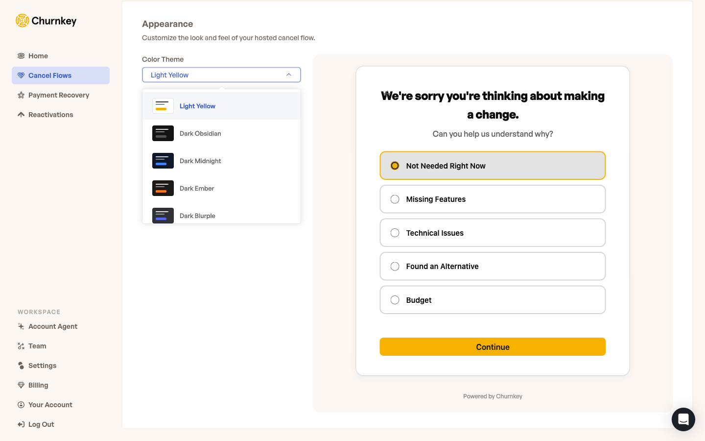
The Color Theme dropdown is the main control. Pick from one of the seven built-in presets, or pick Custom to dial in your own colors.
The built-in presets are:
- Light Yellow — the default; warm, on-brand for Churnkey, friendly
- Light Clean — neutral whites and grays for a minimal look
- Dark Obsidian — deep, near-black background with neutral accents
- Dark Midnight — dark with cool blue accents
- Dark Ember — dark with warm orange accents
- Dark Blurple — dark with vibrant purple-blue accents
- Nebula — gradient-friendly dark theme with cosmic colors
Each preset comes with thoughtfully paired backgrounds, text colors, and call-to-action buttons. Most teams pick the preset closest to their brand and ship.
Custom Theme
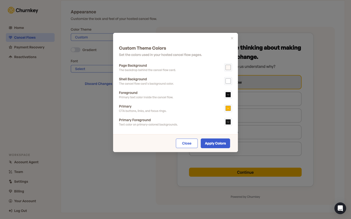
If none of the presets match your brand exactly, select Custom at the bottom of the dropdown. A Customize button appears next to the dropdown — click it to open the Custom Theme Colors modal.
There are five color values to set, each with a clearly labeled role on the page:
| Value | What it controls |
|---|---|
| Page Background | The backdrop behind the cancel flow card |
| Shell Background | The cancel flow card's own background color |
| Foreground | The primary text color inside the cancel flow |
| Primary | Call-to-action buttons, links, and focus rings |
| Primary Foreground | Text on top of primary-colored backgrounds (button labels, etc.) |
Click any swatch to open the color picker, dial in the hex or HSL value you want, and the live preview updates instantly. Hit Apply Colors when you are happy with the result, then Save Changes to publish.
Pick a Primary color with strong contrast against Primary Foreground. The contrast between the two is what determines how readable your call-to-action buttons are at a glance. The same is true for Foreground against Shell Background for body text.
Gradient
Toggle Gradient on to render the page background and primary buttons as 45-degree gradients instead of solid colors. The gradient is generated automatically from your existing theme values — there is nothing extra to configure.
This adds a modern, slightly softer feel that works well with darker themes especially, and pairs nicely with the Nebula preset.
Font
Pick a font for the entire hosted page from the Font dropdown. The dropdown offers a curated mix of web fonts and common system fonts — picks like Inter are loaded automatically by Churnkey, while system options (system-ui, Helvetica Neue, Georgia) render with whatever the customer's device already has installed.
If your brand uses a specific custom font that isn't in the list, reach out to Churnkey support and the team can add it. For most teams, the default — or one of the popular web fonts in the dropdown — feels native and renders crisply on every device.
Live Preview
The right half of the Appearance panel is a live preview of your hosted cancel flow rendered with the current settings. Every change you make to the theme, gradient, or font is reflected immediately — including in interactive elements like the survey radio buttons and the call-to-action.
The preview shows the same first-step survey your real customers see, with the same wording you have configured on your published Cancel Flow. This lets you check that:
- Your call-to-action button is readable (contrast between Primary and Primary Foreground)
- Your body text is comfortable to read (contrast between Foreground and Shell Background)
- The overall feel matches your brand
The live preview only appears once you've published a Cancel Flow. Until then, the Appearance tab shows the controls but no preview panel — finish Flow Configuration first if you want to see your branding rendered live.
The preview reflects unsaved changes so you can experiment freely. Nothing your customers see changes until you hit Save Changes. While you have pending changes, a Discard Changes link appears next to the Save button so you can roll back to the last saved state in one click.
Mobile and responsive
The hosted page is fully responsive out of the box. Your appearance settings — including custom colors and the gradient toggle — render cleanly on mobile, tablet, and desktop without any additional configuration. There is no separate mobile theme to maintain.
What you cannot customize today
Be aware of what the Appearance panel does not control:
- The wording of cancel-flow screens. That is configured per step in your Cancel Flow itself — see Flow Configuration. Appearance only controls how the screens look, not what they say.
- Custom stylesheets. The hosted page is structured: you customize through the supported fields above rather than injecting your own styles. This keeps the page fast, accessible, and resilient to Churnkey product updates.
- A logo image on the hosted page. If logo support is something you need, reach out to Churnkey support — the team can advise on the best approach for your account.